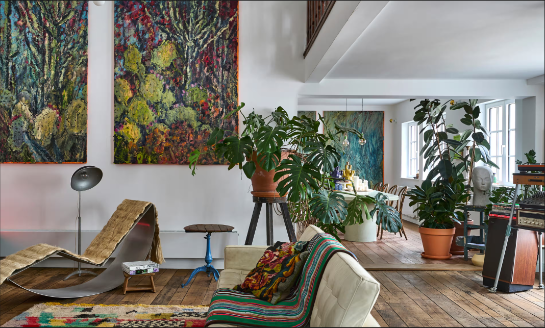
For Belgian painter Nils Verkaeren, a home of his own wasn’t strictly necessary. He could just as easily live as a nomad. “In 2002, I didn’t have an official address. I traded two landscape paintings for a Renault Twingo and set off into the wild. I found it quite easy to have nothing. But owning a home also has its charm.”
But his partner, Eva Wuytjens, needed a place where she felt at home. At first, somewhere in the countryside was their instinct: a logical decision, given that Eva grew up in the country and Nils creates vibrant landscape paintings, preferably in the open air. But also illogical, given their hunger for urban stimuli. “So we decided to search for a home in Antwerp instead,” says Eva. “When we visited this house, right in the city centre, we spontaneously began renovating it in our minds. I understand why many potential buyers backed out: it was a bit of an odd thing. You had to be able to see through the hodgepodge of extensions. The house was divided into numerous small rooms. Additionally, its circulation was not logical at all. You had to walk through various dark spaces before reaching the living areas.”
“It was also unclear from which period the house precisely dated. The property seller mentioned 1947, but the house looks much older,” says Nils. “The old floorboards have 13 different widths. We also discovered the oak beams are identical to those in the 17th-century Rubens House, a stone’s throw from here in Antwerp. Perhaps the house was built with leftover materials at the time.”
To tackle the renovation, they called in a friend and architect, Maarten Tierens. The project was anything but straightforward. “The renovation took shape like my paintings: as a work in progress,” Nils says. “The plans were a continuous ping-pong game between the architect and us two. We kept tweaking them. Fortunately, Maarten is also a painter: he understood that process all too well. It was mainly the contractors who went crazy, as we constantly adjusted our ideas.”
You wouldn’t notice much of that “work in progress” when walking around the house today. Numerous “invisible” interventions have been made, such as updating techniques, insulating, and breaking down unnecessary partitions. But you would swear the house has always looked this way. “It’s quite spacious for a couple with a dog,” Nils admits. “I can really spill with space here. It sounds decadent, but I consume a lot of space, just like my work. I see our house as a blank canvas: it can evolve in any direction. We wanted to keep the functions as open as possible. If we want to turn the living room into a large dining area tomorrow, we can do that perfectly. I’d put a bathtub in front of our open fireplace if I could. Why limit the spaces to the predestined functions? A house should be a living composition, just like a garden or a painting.”
Nils and Eva didn’t buy all-new furniture and artwork for their home. “We already had quite a few heirlooms from my grandparents, who were both antique dealers,” says Nils. The couple combined these antiques with striking contemporary elements, such as the Chill Chair by Zigmund Pront and the yellow Dikarya tube chandelier in the living room, designed by Yves Pauwels for Falluce. “Here and there, we’ve hung artworks by fellow artists with whom I’ve exchanged pieces. Many works still need a place. I find that difficult. Once you hang something, it immediately feels so definitive. As if it’s there forever.”
Even though quite a few of his own landscape paintings are in the house, you can hardly call Nils and Eva’s place a studio home because he prefers to work on location, alone, in the open air. “Last summer, I was in the Moroccan desert, with temperatures up to 50C. Those conditions force me to work and see differently. A home studio doesn’t challenge me enough in that respect.”


